The context
OLX is a classifieds platform with around 22 million monthly users in Brazil
Users sell and buy items from one another on a pay and ship model. In this context, checkout is a fundamental stage of the purchase journey, however, the journey presented several user experience (UX) issues, which distanced us from our business objectives, in addition to being visually outdated compared to the company's design system standards. This case presents how we redesigned it to increase conversion.
Business goals
↑ Conversion Rate
Data & Desk research
In conjunction with the Product Manager and the Data Analyst, we gathered all the existing knowledge within the team on the topic, featuring the following information
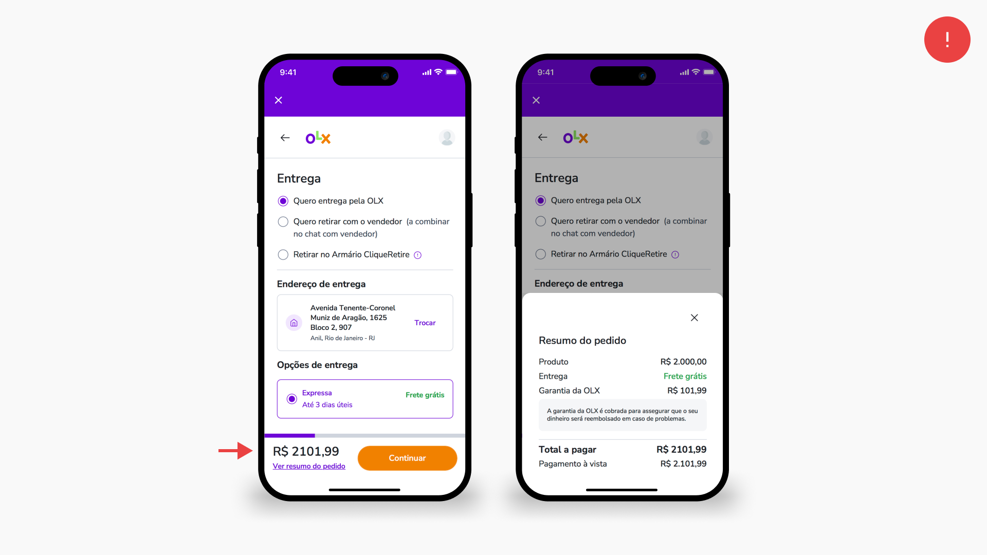
Users in CSAT complained about only seeing the full price, including fees, at the end of the flow, suggesting it was one of the reasons for purchase abandonment.
Users with an applied coupon had a greater tendency to complete the purchase.
The largest drop-off occurred during the payment method step.
The more interest-free installments offered, the higher the conversion rate.
Usability testing
To have a qualitative perspective of the user experience we conducted a usability test with 12 users from different demographics
The users were divided into users who have previously made purchases using OLX's pay and ship model and users who have not. The mission they had to accomplish was to make a purchase of a cell phone (advertised by us) with a card supplied by us, sending it to an address determined by us.
Test insigths
Global navigation
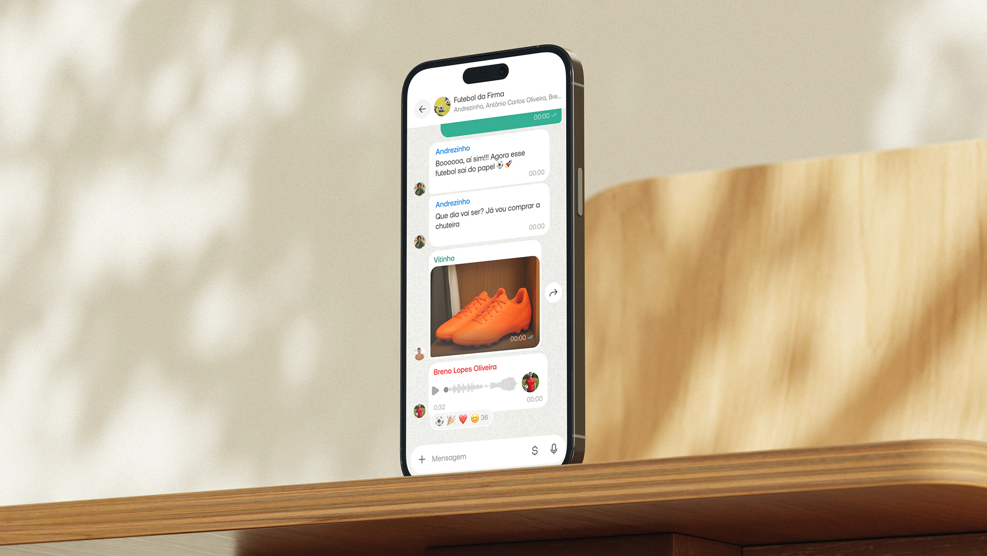
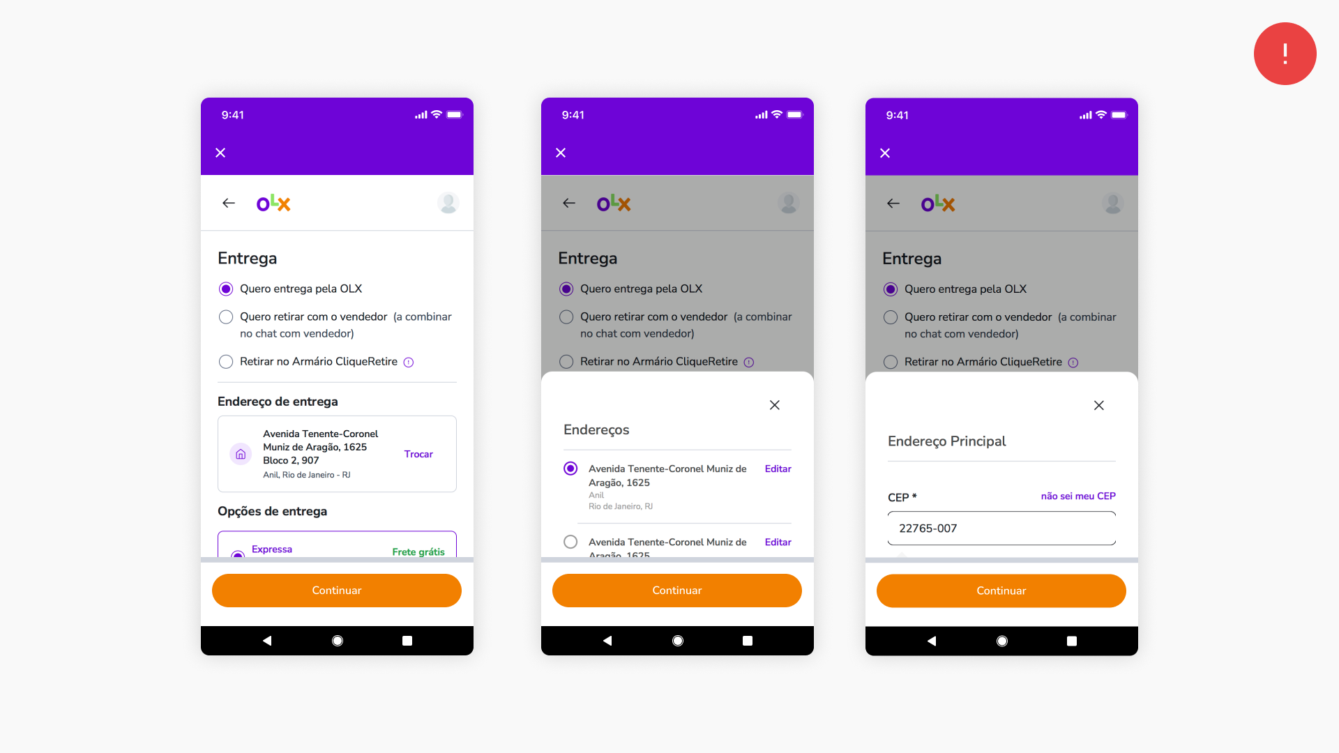
Android users who clicked the system navigation bar's back button were closing the flow unintentionally instead of returning to the previous step. This was happening because the checkout was a web view and it was having an unexpected behavior.
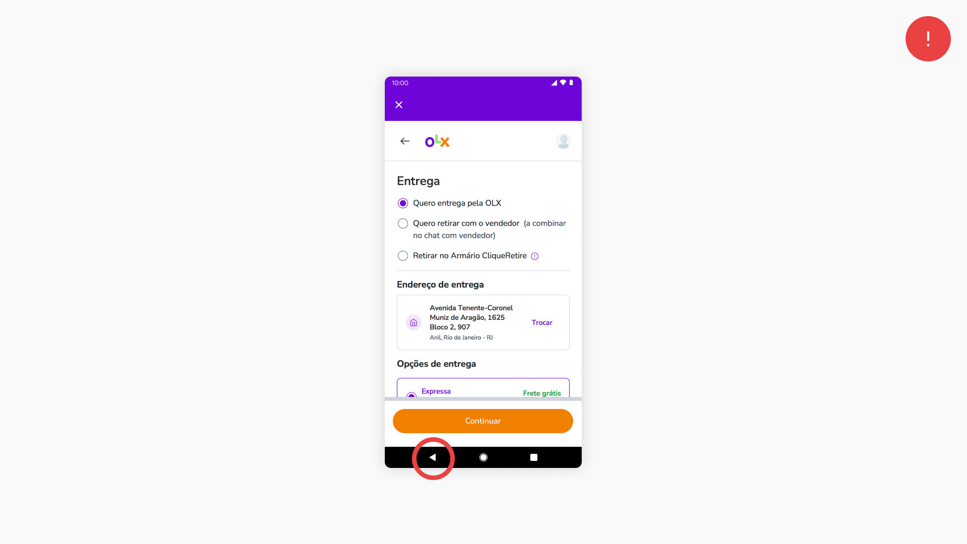
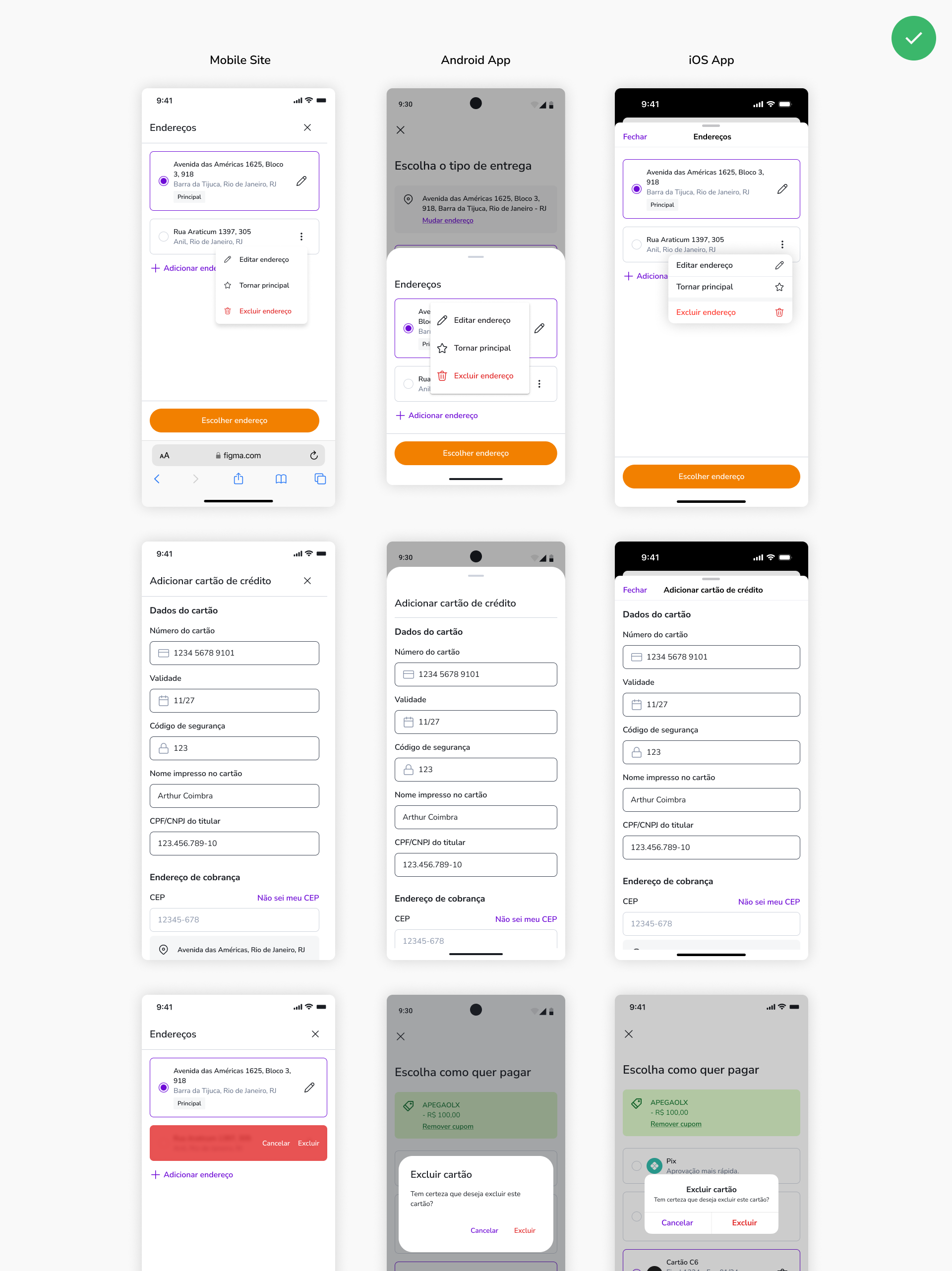
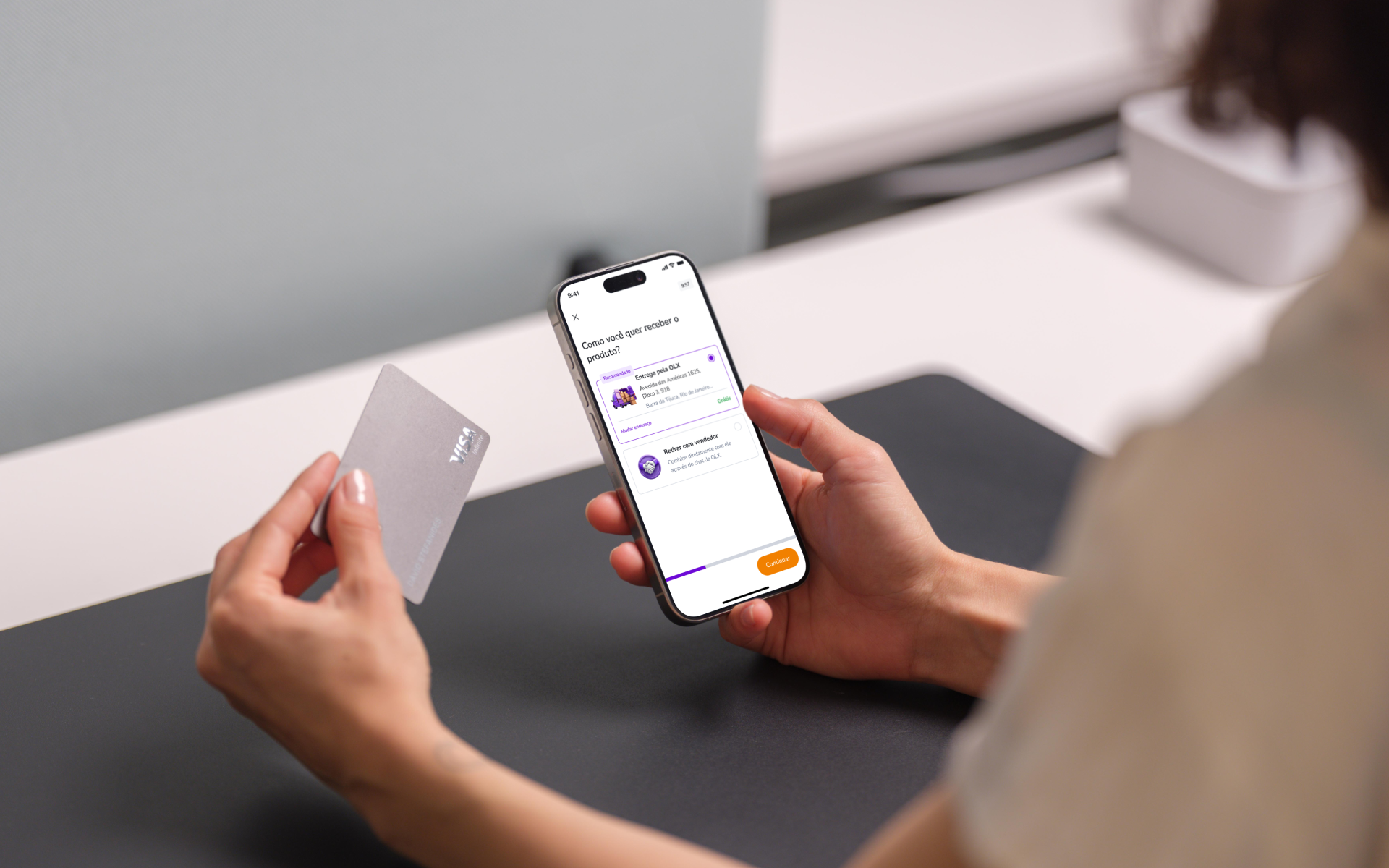
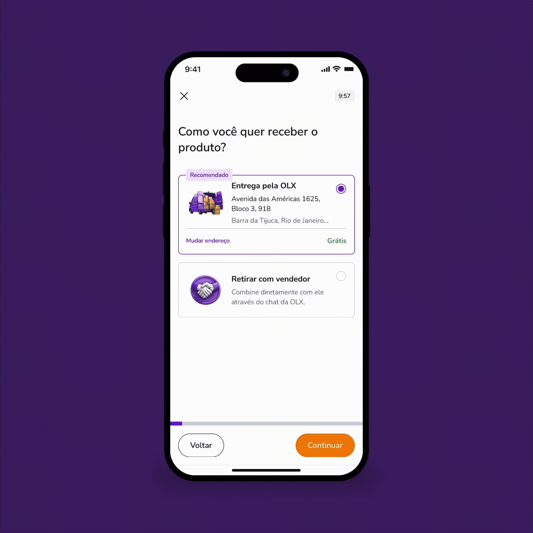
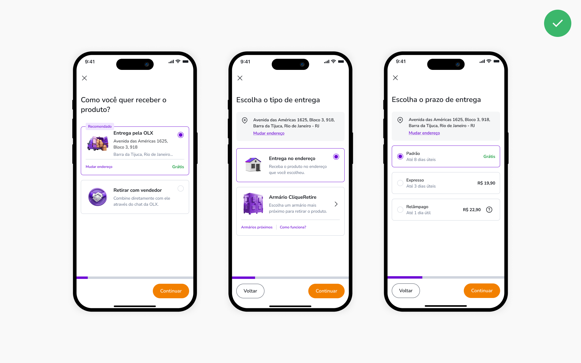
Shipping Method
skipping new address insertion
Users who already had a registered address past this step inattentively. In addition to that, the delivery time were often ignored too.
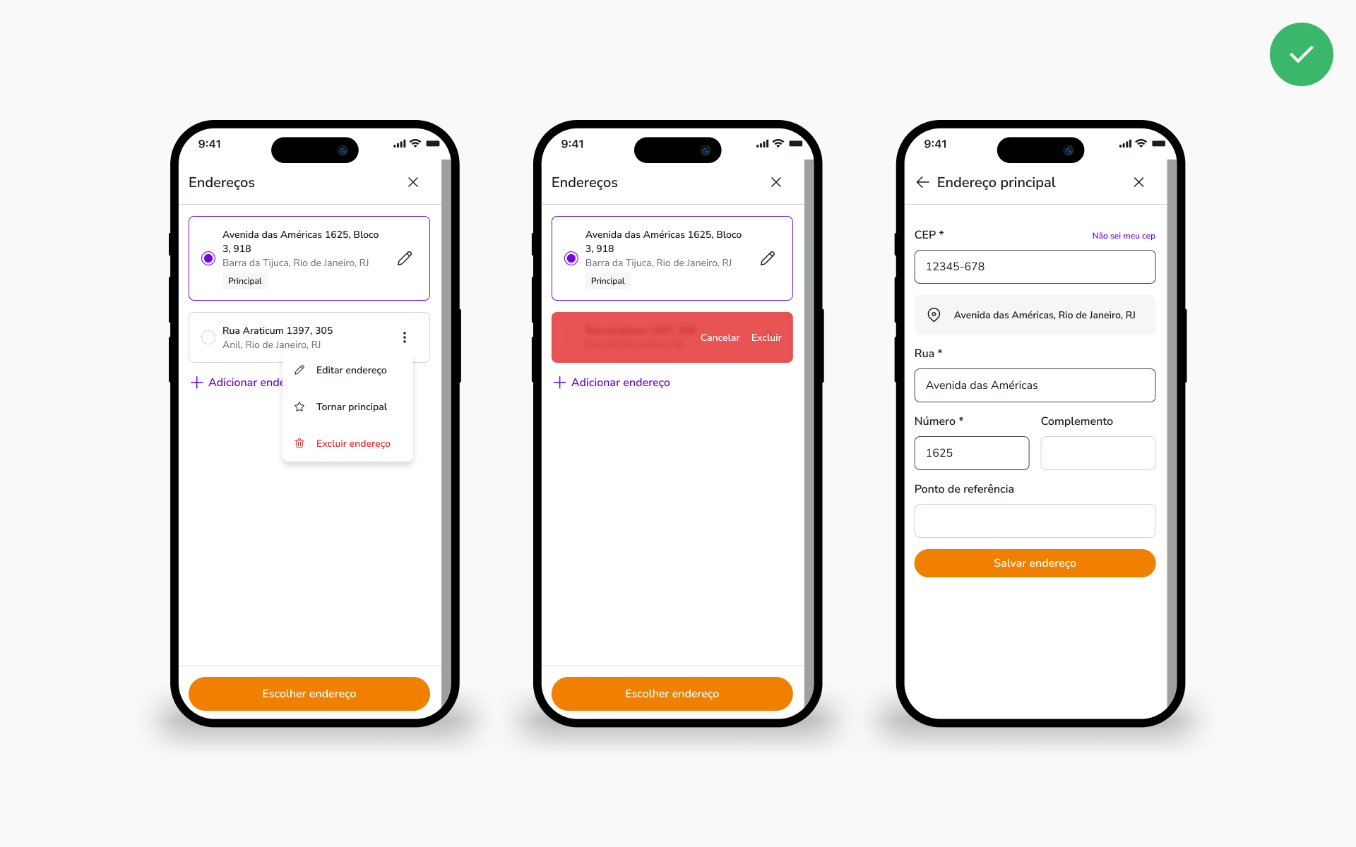
trouble to input address data
Users who added a new address encountered many difficulties due to modal positioning issues.
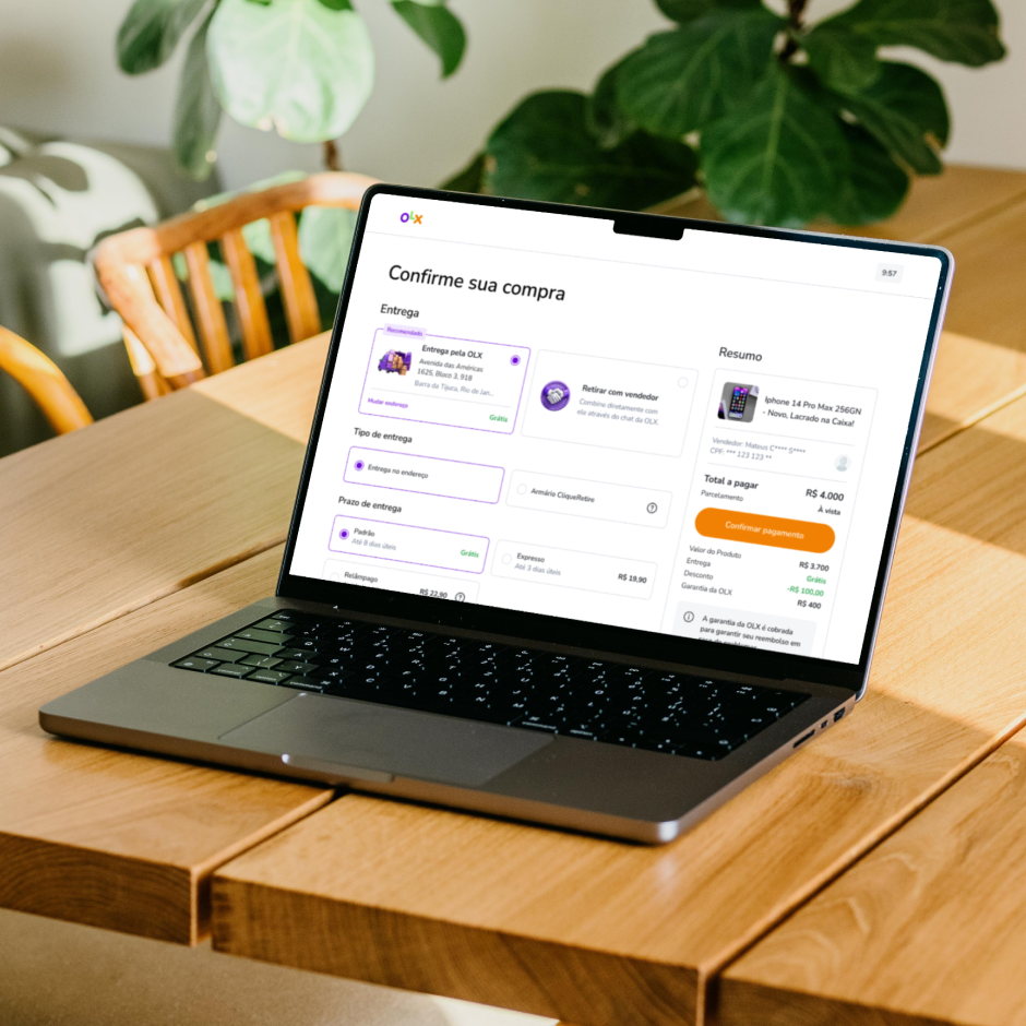
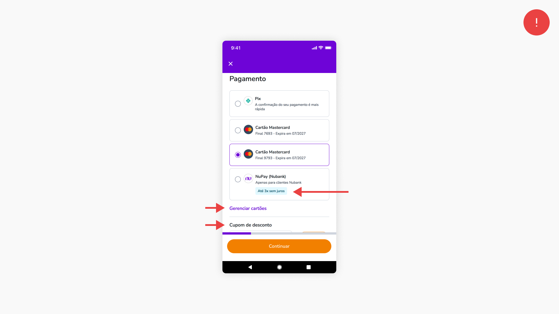
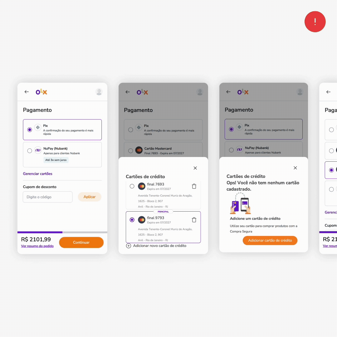
Payment Method
coupon field out of sight
Users who had more than one registered card had difficulty finding the field to add discount coupons because the field was outside the first fold (below the fold).
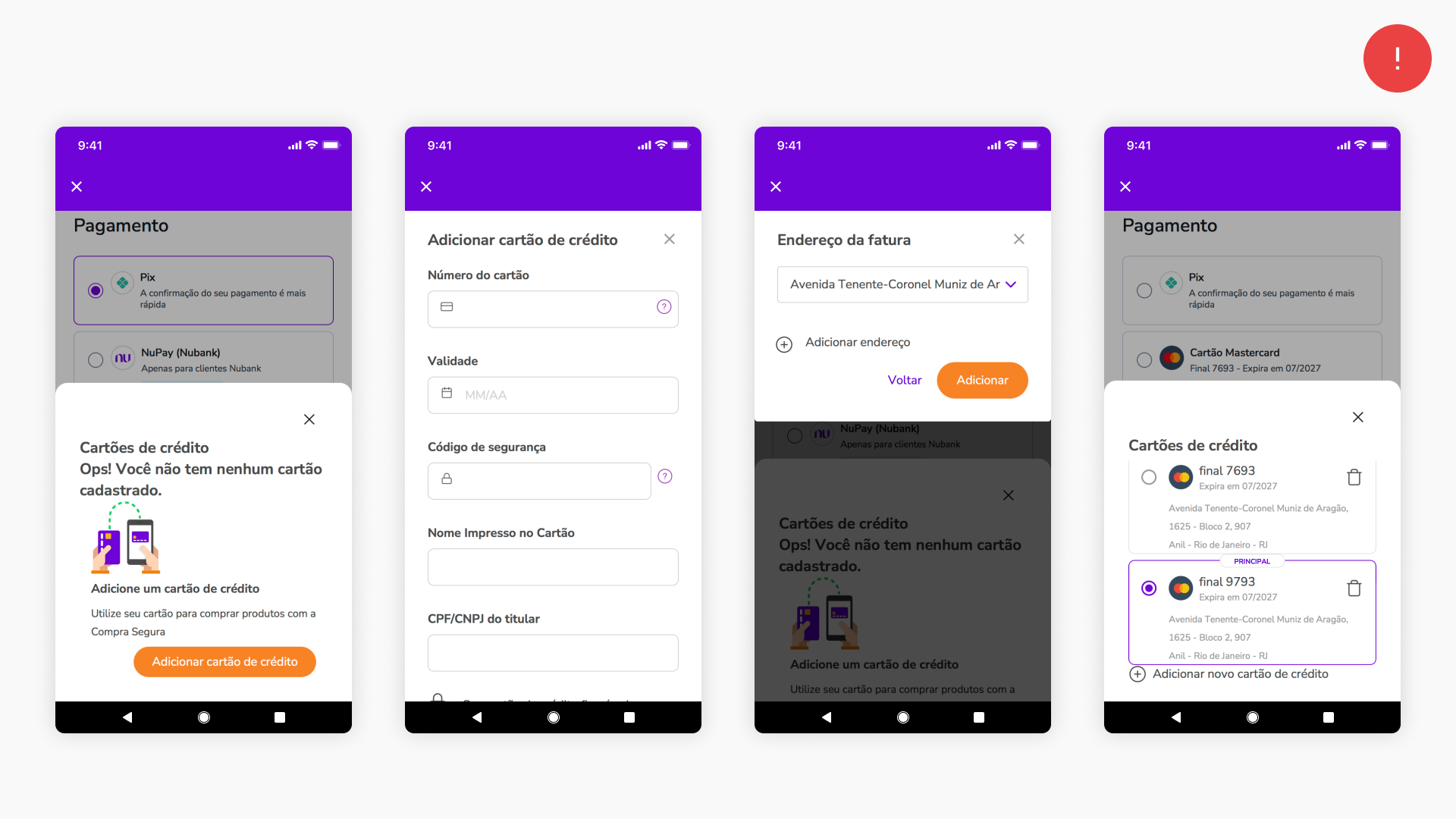
adding a new card wasn't intuitive
The option to add a new credit card was difficult to find because it was located inside the "manage cards" link witch proved to be not intuitive.
free installment options wasn't clear
Only NuPay displayed the tag for interest-free installments, even though any credit card offered this benefit, leading users to interpret that there were no interest-free installments for the cards.
poor touch areas
When adding the new card, users encountered many difficulties due to modal positioning and touch area issues, for example: A card could only be selected by clicking on the radio button and not on the card itself.
new added card not selected
Added card was not automatically selected, leading users to proceed with the wrong card selected.
Solution Hypotesys
Given everything we have learned, we tested the following hypotheses via A/B testing to impact our desired results.
Full Price
If we display the full price, including fees, providing visibility to an account summary, we will increase the conversion rate because we will avoid negative surprises at the end that cause users to abandon the purchase.
Conversion rate: -5% Android & iOS | -6% mobile site
RESULT: INVALIDATED
Despite being a user request, we confirmed via A/B testing that upon seeing the full price from the beginning, the conversion rate was negatively impacted.
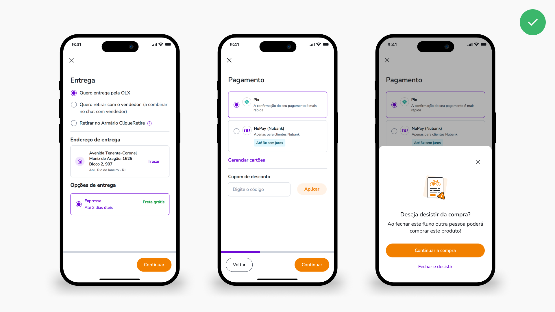
New Global Navigation
If we fix the global navigation of the checkout process, and add an extra exit confirmation step, we will increase the conversion rate because users will no longer accidentally close the flow.
Conversion rate: No variation
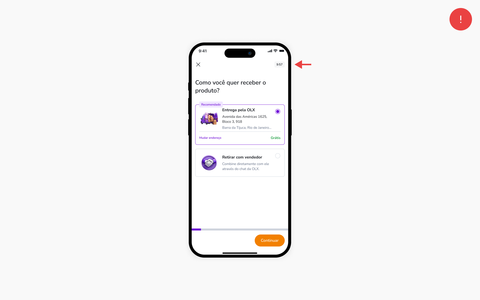
Delivery Method
If we fix the usability issues in the address forms, we will increase the conversion rate and reduce the drop-off at this step because users will find it easier to complete the task.
Conversion rate: +1% Android | +1% iOS | +4% Mobile site | +2% Desktop
RESULT: Validated
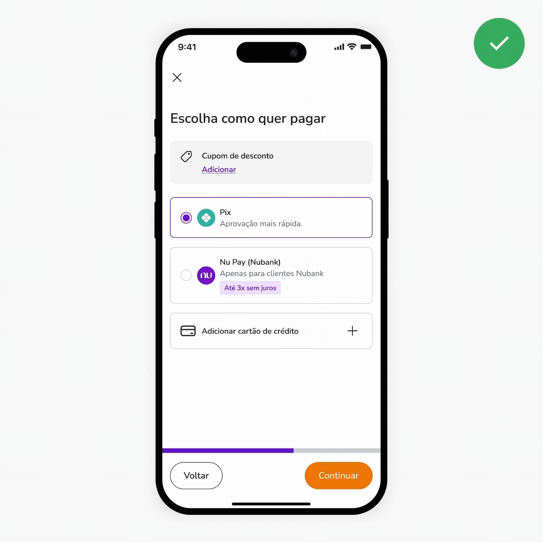
Payment Method
If we simplify the addition and management of cards, we will increase the conversion rate and reduce the drop-off at this step because users will find it easier to complete the task.
+
If we improve the visibility of the coupon area, we will increase the rate of users with applied coupons because they will find the option more easily.
Conversion rate: +2% Android | +2% iOS | +11% mobile site | +3% Desktop
Drop off on payment step: -6% Android | -7% IOS | -22% Mobile site
RESULT: Validated
Checkout Timer
If we add a countdown timer to the checkout, we will increase the conversion rate because we will leverage cognitive biases such as FOMO, urgency, and scarcity triggers.
Conversion rate: no variation
RESULT: inValidated
Final conversion rate results
+3% Android | +3% iOS | +15% mobile site | +5% Desktop
Visual patterns
As the user interface were also outdated in relation to the Design System, at the end of the tests the other screens were updated with the most recent visual guidelines.

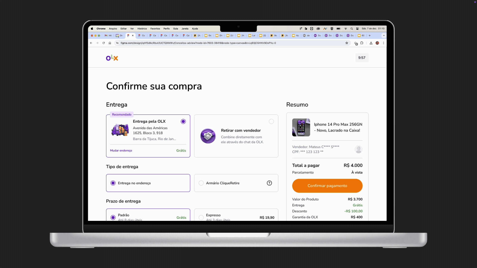
Checkout Nativization
After the hypothesis validations were concluded, we replaced the web view for native experiences of Android and iOS to provide a better performance and user experience.